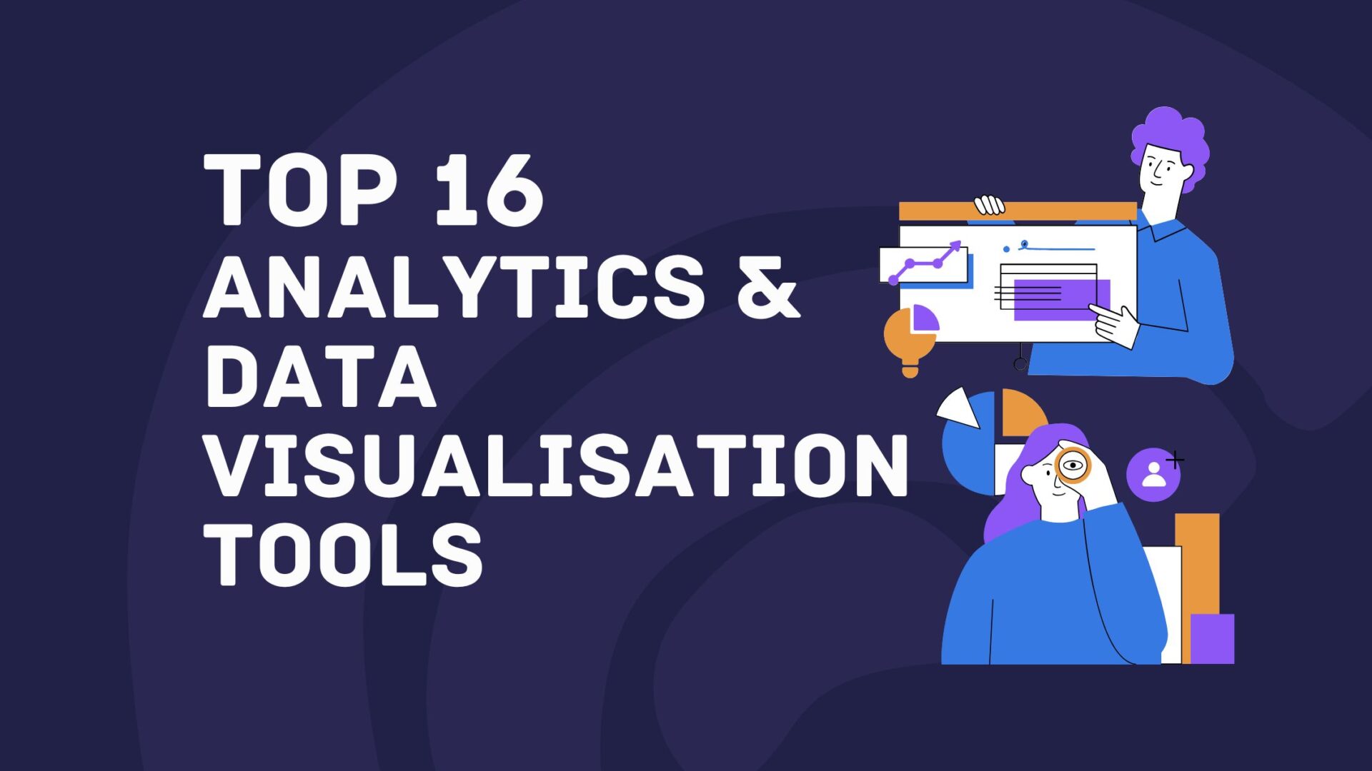
Data is only useful if people can actually understand it. As organisations collect more information than ever, the ability to turn raw numbers into clear, visual insights has become essential not just for analysts, but for decision-makers across the business.
Analytics and data visualisation tools have moved well beyond static charts and spreadsheets. In 2026, the best platforms combine intuitive dashboards, real-time reporting, AI-assisted insights, and seamless integrations with cloud data sources. Whether you’re tracking performance, uncovering trends, or sharing insights with stakeholders, choosing the right tool can make a huge difference.
Below, we’ve rounded up 16 of the best analytics and data visualisation tools for 2026, covering a mix of enterprise platforms, modern cloud tools, and flexible open-source options.
1. Tableau


Overview: Tableau is one of the most widely used data visualisation tools in the world, designed to help organisations explore, analyse, and present data in a highly visual way. It allows users to build interactive dashboards that make complex datasets easier to understand and act on. Over the years, Tableau has continued to evolve with stronger AI-driven insights and advanced analytics capabilities.
Best for: Teams and organisations that need powerful, flexible data visualisation and interactive dashboards across multiple data sources.
Key features:
-
Drag-and-drop data visualisation
-
Interactive dashboards and storytelling tools
-
Broad integrations with cloud and on-premise data sources
-
AI-assisted insights and predictive analytics
Things to consider: Tableau’s pricing can be high for larger teams, particularly at enterprise scale. More advanced use cases often require experienced analysts or technical users to manage data models effectively. Smaller teams may find the platform more complex than necessary.
Case studies: View all case studies
")

Overview: Power BI is Microsoft’s analytics and data visualisation platform, built to work seamlessly with Excel, Azure, and the wider Microsoft ecosystem. It enables organisations to create dashboards, reports, and real-time analytics without heavy technical overhead. Regular updates and AI-powered features continue to strengthen its capabilities.
Best for: Businesses already using Microsoft products that want strong analytics at a competitive price point.
Key features:
-
Native integration with Excel and Microsoft 365
-
Real-time dashboards and reporting
-
AI-powered insights and natural language queries
-
Extensive connector library
Things to consider: Power BI delivers the most value when used within the Microsoft ecosystem. Complex data models and large datasets can become harder to manage over time. Some advanced features require higher-tier licences.
Case studies: Not available

Overview: Looker is a cloud-native analytics platform that focuses on consistent metrics and governed data exploration. It uses a centralised modelling layer to ensure everyone works from a single source of truth. This makes Looker particularly attractive for organisations with complex data environments.
Best for: Data-driven organisations using Google Cloud or modern cloud data warehouses.
Key features:
-
Centralised semantic modelling with LookML
-
Deep integration with Google Cloud
-
Embedded analytics capabilities
-
Scalable, cloud-first architecture
Things to consider: Looker has a steeper learning curve than many BI tools. Teams often need dedicated data expertise to build and maintain models. It may feel restrictive for users who prefer fully self-service analytics.
Case studies: View all case studies
4. Qlik Sense

Overview: Qlik Sense is a self-service analytics platform known for its associative data engine. It allows users to explore data freely, uncovering relationships that might be missed in traditional BI tools. This makes it well suited to exploratory and ad-hoc analysis.
Best for: Teams that want interactive, self-service analytics without rigid dashboards.
Key features:
-
Associative data exploration
-
Interactive dashboards and visualisations
-
AI-assisted insights
-
Strong data integration options
Things to consider: The interface can feel less intuitive for first-time users. Licensing models can be complex depending on deployment. Training is often required to unlock its full potential.
Case studies: View all case studies
5. ThoughtSpot

Overview: ThoughtSpot is designed around search-driven analytics, allowing users to ask questions of their data using natural language. This removes many of the barriers traditionally associated with analytics tools. It’s built to encourage wider data adoption across organisations.
Best for: Business users who want fast, self-service insights without heavy analyst involvement.
Key features:
-
Natural language search and queries
-
AI-driven insights and recommendations
-
Cloud-native deployment
-
Embedded analytics
Things to consider: Visual customisation options are more limited than traditional BI platforms. Complex analytical workflows may still require analyst support. Pricing can be high for smaller teams.
Case studies: View all case studies
6. Sisense

Overview: Sisense is an analytics platform built with embedded analytics in mind. It allows organisations to integrate dashboards and insights directly into applications and products. This makes it especially popular with SaaS companies and product teams.
Best for: Embedded analytics and customer-facing dashboards.
Key features:
-
Embedded analytics APIs
-
Flexible data modelling
-
Cloud and hybrid deployment options
-
Customisable dashboards
Things to consider: Sisense is more developer-focused than many BI tools. Non-technical users may find it less intuitive. Implementation often requires engineering support.
Case studies: View all case studies
7. Domo

Overview: Domo is a cloud-based analytics platform that combines data integration, visualisation, and collaboration in one place. It’s designed to give teams real-time visibility into business performance. The platform is particularly strong for executive dashboards.
Best for: Organisations that want live dashboards and cross-team data visibility.
Key features:
-
Real-time data updates
-
Built-in data connectors
-
Collaboration and sharing tools
-
Mobile-friendly dashboards
Things to consider: Domo is positioned at a premium price point. Its opinionated approach may limit flexibility for some teams. Complex data modelling can be challenging.
Case studies: View all case studies


Overview: Mode Analytics combines SQL, Python, and interactive reporting in a single platform. It’s built to support collaboration between analysts and business stakeholders. This makes it a strong choice for data teams working closely with decision-makers.
Best for: Analytics teams working closely with business stakeholders.
Key features:
-
SQL and Python notebooks
-
Interactive visual reports
-
Collaboration and version control
-
Cloud data warehouse integrations
Things to consider: Mode assumes technical knowledge. It’s not designed for non-technical users. Smaller teams may find it more powerful than necessary.
Case studies: View all case studies

Overview: Apache Superset is an open-source data exploration and visualisation platform. It offers enterprise-grade features while remaining highly flexible. Many organisations adopt it for custom BI solutions.
Best for: Organisations looking for a flexible, open-source BI solution.
Key features:
-
Open-source and highly customisable
-
Interactive dashboards
-
SQL-based data exploration
-
Scalable architecture
Things to consider: Superset requires technical setup and maintenance. There’s no official commercial support by default. Usability depends heavily on implementation.
Case studies: Not available
10. Metabase

Overview: Metabase is a user-friendly analytics tool focused on simplicity. It allows teams to explore data and build dashboards without writing SQL. This makes it ideal for quick insights and internal reporting.
Best for: Small to mid-sized teams wanting quick insights.
Key features:
-
No-code data exploration
-
Simple dashboard creation
-
Open-source and cloud options
-
Fast setup
Things to consider: Advanced analytics features are limited. Customisation options are relatively basic. It may not scale well for large enterprises.
Case studies: View all case studies
11. Zoho Analytics

Overview: Zoho Analytics is a self-service BI and reporting tool designed to be accessible and affordable. It integrates tightly with Zoho’s wider suite of business tools. This makes it a practical choice for growing businesses.
Best for: SMEs and Zoho users looking for cost-effective analytics.
Key features:
-
Drag-and-drop reporting
-
AI-powered insights
-
Wide range of connectors
-
Competitive pricing
Things to consider: It’s less suited to complex enterprise analytics. Visualisation options are more limited than premium tools. Performance can suffer with very large datasets.
Case studies: View all case studies

Overview: IBM Cognos Analytics is a mature enterprise BI platform with a strong focus on governance and reporting. It’s widely used in regulated industries where accuracy and control are critical. AI-assisted features have modernised its traditional reporting strengths.
Best for: Large enterprises with complex reporting needs.
Key features:
-
Enterprise reporting and dashboards
-
AI-assisted data discovery
-
Strong governance and security
-
Cloud and on-prem deployment
Things to consider: The interface can feel dated compared to newer tools. Setup and maintenance require resources. Licensing costs can be high.
Case studies: View all case studies

Overview: SAP Analytics Cloud combines analytics, planning, and predictive insights in one cloud platform. It’s designed to work seamlessly with SAP’s ERP and data products. This makes it a natural fit for SAP-centric organisations.
Best for: Organisations already using SAP software.
Key features:
-
Integrated analytics and planning
-
Predictive and forecasting tools
-
SAP ecosystem integration
-
Cloud-native platform
Things to consider: Less flexible outside SAP environments. Customisation options can feel constrained. Licensing may be complex.
Case studies: View all case studies
14. Strategy

Overview: Strategy is an enterprise analytics platform known for scalability and security. It’s commonly used by large global organisations with complex data needs. Mobile analytics is one of its standout strengths.
Best for: Enterprises with complex analytics and governance needs.
Key features:
-
Enterprise-grade security
-
Scalable analytics architecture
-
Mobile BI capabilities
-
Advanced reporting
Things to consider: The platform has a steep learning curve. Costs are high compared to many alternatives. Implementation typically requires specialist expertise.
Case studies: View all case studies
15. Grafana

Overview: Grafana is an open-source visualisation tool primarily used for monitoring and observability. It excels at real-time metrics and time-series data. Engineering and DevOps teams widely rely on it.
Best for: Monitoring, observability, and real-time metrics.
Key features:
-
Real-time dashboards
-
Wide range of data source integrations
-
Open-source core
-
Alerting and monitoring
Things to consider: It’s not designed for traditional business reporting. Non-technical users may struggle. Advanced analytics require additional tools.
Case studies: View all case studies
16. Redash

Overview: Redash is a lightweight analytics and visualisation tool focused on SQL-based analysis. It prioritises speed and simplicity over advanced features. Many teams use it for internal dashboards and ad-hoc reporting.
Best for: Teams that want straightforward SQL-driven analytics.
Key features:
-
SQL query editor
-
Simple dashboards
-
Data source integrations
-
Open-source option
Things to consider: Limited visualisation options. Governance and permissions are basic. Not suited for complex enterprise use cases.
Case studies: View all case studies
How We Selected and Ranked These Tools
-
Usability: We looked at how easy each tool is to use in day-to-day work, not just in demos. That includes how quickly new users can get value from it, as well as how practical it is for more advanced teams working at scale.
-
Visualisation quality: Strong analytics depends on clear visuals, so we assessed how flexible and polished each platform’s dashboards and charts are. Tools that make it easier to communicate insights, not just display data, scored higher.
-
Scalability: We considered how well each tool performs as data volumes, users, and reporting needs grow. This includes reliability, performance, and whether the platform can support more complex use cases over time.
-
Integration: Modern analytics tools need to fit neatly into existing data stacks, so we prioritised platforms that integrate well with cloud warehouses, business tools, and common data sources without excessive setup.
-
Market relevance: Finally, we looked at adoption, ongoing product development, and long-term viability. Tools that continue to innovate and show strong momentum in the market were ranked more highly.
Choosing the Right Tool Is Only Half the Story
There’s no single “best” analytics and data visualisation tool — the right choice depends on your data maturity, internal skills, and business goals. Some organisations will value ease of use and speed, while others need stronger governance, scalability, or deeper technical flexibility to support complex decision-making.
Whichever route you take, investing in the right analytics platform in 2026 will only deliver real value if it’s paired with a clear data strategy and the right expertise. If you need help turning data into insight, from analytics strategy and data integration to performance reporting and marketing intelligence, Munro Agency can help. Get in touch to see how our data-driven approach can support smarter growth.
FAQs
An analytics and data visualisation tool helps organisations analyse data and present it using charts, dashboards, and reports. These tools turn raw data into visual insights that are easier to understand and act on. They are commonly used to track performance, identify trends, and support decision-making.
There is no single best data visualisation tool in 2026, as the right choice depends on your needs. Tableau and Power BI are popular for enterprise reporting, while tools like Metabase and Grafana suit simpler or more technical use cases. The best option is the one that fits your data sources, users, and goals.
To choose the right analytics tool, start by understanding who will use it and what decisions it needs to support. Consider ease of use, integration with your data sources, scalability, and cost. Testing a short list with real data is often the most reliable approach.
Open-source analytics tools can be a strong alternative if you have technical expertise in-house. Platforms like Apache Superset, Metabase, and Grafana offer flexibility and lower licensing costs. However, they often require more setup, maintenance, and support compared to commercial tools.
Yes, analytics and data visualisation tools play a key role in marketing and growth decisions. They help teams track performance, understand customer behaviour, and measure ROI across channels. When combined with a clear data strategy, they can directly support smarter, data-driven growth.